From Idea to Design: My Simple Process for Creating Stunning Graphics
Profile Card Summary: Learn how I turn simple ideas into beautiful, professional graphics through my design process. SEO Description: Discover my simple graphic design process for turning ideas into professional, eye-catching visuals
From a Blank Page to a Finished Flyer: My Graphic Design Process
Creating a good graphic is not just about making something look beautiful. For me, it starts with understanding the message and then finding a way to present that message clearly.
I enjoy graphic design, and one process I use is starting with a simple idea and gradually turning it into a complete visual design. In this guide, I'll share the steps I follow when creating promotional graphics and simple designs.
- Start With the Purpose
Before designing anything, I ask myself one important question:
What is this design supposed to communicate?
For example, when I created a promotional design for WURK, the purpose was to introduce the platform and communicate its opportunities in a way that would catch people's attention.
Knowing the purpose helps me decide what information deserves the most attention.
- Gather the Information
Once I understand the purpose, I collect the information that needs to appear on the design.
For a promotional flyer, this could include:
- Brand name or logo
- Main headline
- Short description
- Key benefits
- Call to action
- Website or social media information
- Other important details
I try not to treat every piece of information as equally important. Some things need to stand out more than others.
- Choose a Colour Direction
Colour is one of the first things people notice.
I choose colours based on the message and brand I'm designing for. I also try to make sure the colours work well together and that the text remains easy to read.
For my WURK design, I used a blue-and-white direction because it creates a clean, modern and professional appearance that works well with the WURK branding.
- Create a Clear Layout
After deciding on the colours and information, I think about where everything should go.
A simple layout could have:
- Logo at the top
- Strong headline near the main visual
- Supporting information underneath
- Main image on one side
- Benefits or features in a separate section
- Call to action near the bottom
Good spacing is important too. I don't want every part of the design competing for attention.
- Choose the Main Visual
The main image should support the message rather than distract from it.
For my WURK promotional design, I used a person holding a smartphone because the phone helped communicate the idea of accessing the platform and its opportunities.
When using AI-generated visuals, I describe the type of person, setting, mood, clothing, objects and overall style I want. I then select or refine the result that fits the design best.
- Build the Design
This is where the different elements come together.
I combine the colours, text, images, logo and other design elements while paying attention to alignment and spacing.
At this stage, I don't just ask whether the design looks attractive. I also ask:
Can someone understand the message quickly?
If the answer is no, something probably needs to be simplified or rearranged.
- Review and Improve
I always look at the finished design carefully before considering it complete.
I check:
- Is the text readable?
- Is anything too crowded?
- Does the main message stand out?
- Are the colours working together?
- Is the information arranged logically?
- Does the design look balanced?
- Is anything unnecessary?
Sometimes a small adjustment to spacing, font size or positioning can make a big difference.
- A Real Example From My Work
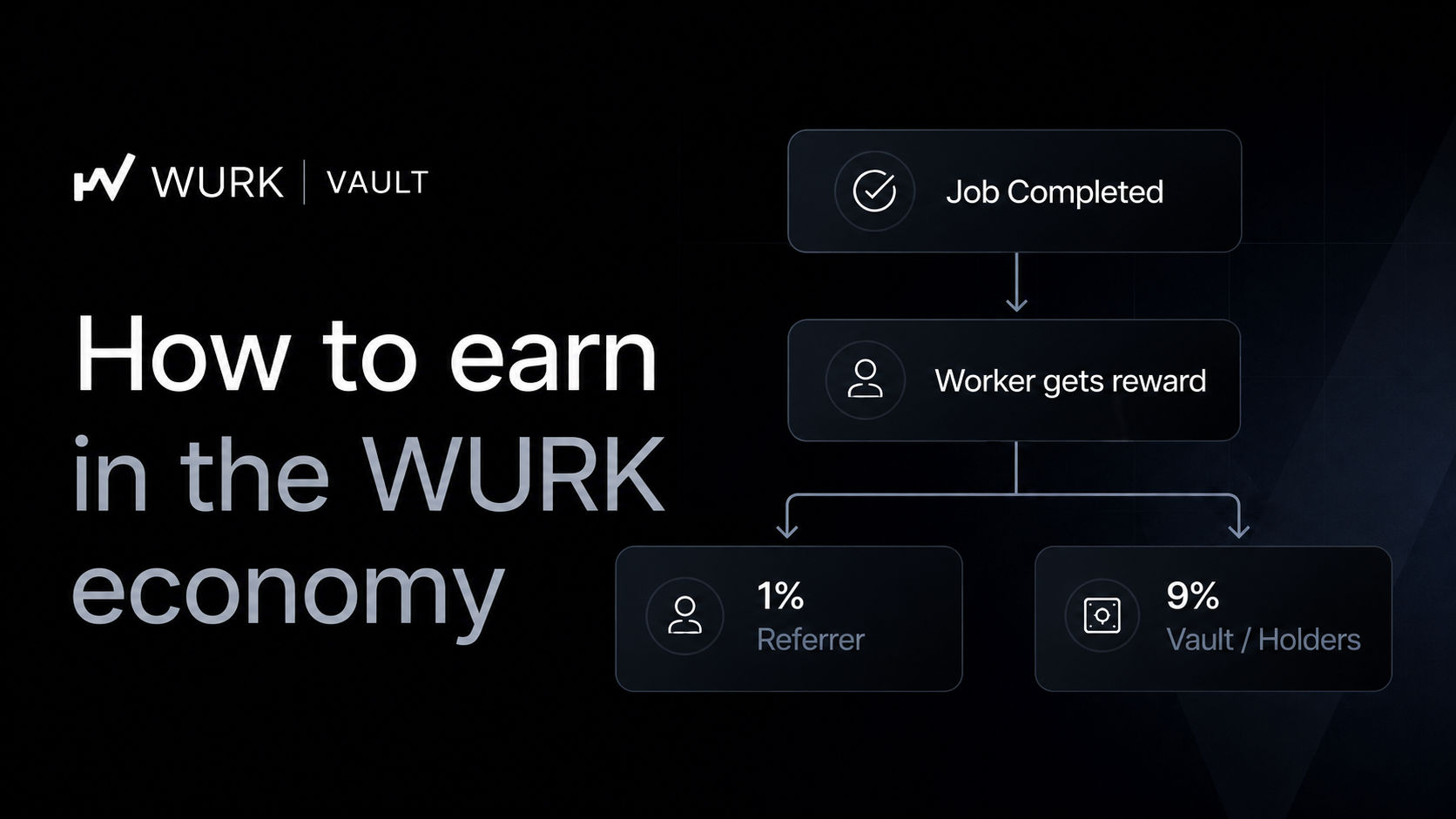
One example is the WURK promotional graphic I created.
I combined the WURK branding with a strong headline, a smartphone visual, information about the platform, feature sections and a call to action.
I also presented the design as a physical flyer to see how it would look outside a digital screen.
This helped me think about the design as something that could actually be used for promotion rather than simply being an attractive image.
- Simple Designs Can Work Too
Graphic design doesn't always have to involve lots of elements.
I also created a simple Alhamdulillah design using a yellow background, Arabic text and an English translation.
The design is much simpler, but the same principles still apply: colour, typography, spacing, readability and visual balance.
Sometimes removing unnecessary elements can actually make a message stronger.
- My Biggest Design Lesson
One thing I've learned is that good design starts with the message, not the decoration.
It is easy to keep adding images, colours and effects because they look nice. But if they make the design difficult to understand, they are not helping.
I try to make every element have a reason for being there.
Conclusion
My graphic design process is simple: understand the purpose, gather the information, choose a colour direction, plan the layout, create or select the right visual, put everything together, and then review the result.
You don't need to create the perfect design on your first attempt. Start with the idea, build it step by step, and don't be afraid to make changes.
The more designs you create, the better you'll become at knowing what works and what doesn't.
For me, graphic design is about taking a simple idea and turning it into something people can see, understand and remember.


Latest comments
1