How I Use AI Prompts to Turn Simple Ideas Into Better Graphics
Graphic design is a skill I enjoy, and one thing I've learned from creating graphics with AI is that the result depends a lot on how well you explain your idea. AI can help turn an idea into a visual, but it still needs clear instructions from you.
In this guide, I'll share how I approach AI prompting when creating graphics and some simple techniques that can help you get better results.
- Start With a Clear Idea
Before writing a prompt, I first decide what I want the graphic to communicate.
For example, if I'm creating a promotional graphic for WURK, I don't just ask AI to "make a WURK design." I think about what the design should achieve.
I might want it to:
Promote WURK
Explain what WURK offers
Attract someone's attention
Look professional
Encourage people to learn more
Having a clear purpose makes it easier to write the prompt.
- Describe the Important Details
After deciding on the idea, I describe the elements I want in the design.
For a promotional graphic, I consider things such as:
The main subject
The headline
Supporting text
Background
Images or objects
Logo placement
Overall layout
Instead of giving AI a very short instruction, I try to explain what I actually want to see.
For example:
Create a professional promotional graphic for WURK. Use a clean blue and white visual style, include a strong headline, show a person using a smartphone, and organize the information into clear sections that are easy to read.
The more clearly I communicate the idea, the easier it is to work toward the result I have in mind.
- Choose the Right Visual Style
The style of a graphic can completely change how it feels.
Depending on the purpose, I might want something:
Modern
Minimal
Professional
Futuristic
Colorful
Simple
Bold
For a professional promotional design, I usually prefer a clean layout that doesn't make the viewer work too hard to understand the message.
- Think About the Layout
A good graphic isn't only about having attractive elements. Those elements also need to be arranged properly.
When writing a prompt, I think about where the important things should go.
For example:
Main headline on the left
Main visual on the right
Important information underneath
Logo at the top
Call-to-action near the bottom
Giving AI an idea of the composition can help prevent the design from looking random or overcrowded.
- My WURK Design Example
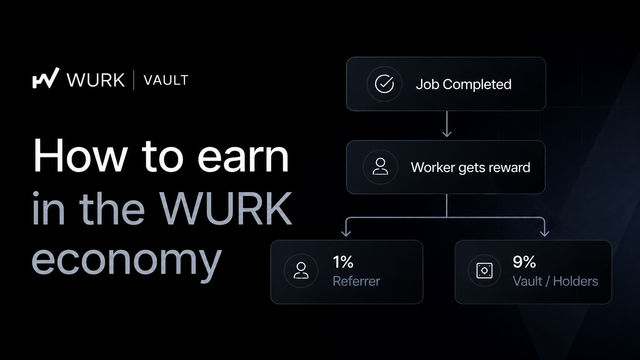
One of the graphics I've created was a promotional WURK design.
I wanted it to communicate what WURK is while making the design attractive and easy to understand.
The design included the WURK branding, a large headline, a person holding a phone, information about opportunities on WURK, reasons to choose WURK, and a section encouraging people to join.
The main challenge was fitting several pieces of information into one design without making it look confusing.
This taught me that when a design contains a lot of information, the prompt needs to give attention to organization and hierarchy, not just appearance.
- Don't Expect the First Result to Be Perfect
One of the biggest lessons I've learned is that the first generated image doesn't always match the idea in my head.
Instead of giving up, I look at the result and ask:
What looks good?
What is missing?
What needs to be changed?
Is the background too busy?
Is the composition balanced?
Does the design communicate the intended message?
Then I improve the prompt.
Sometimes a small change in the instruction can make a noticeable difference.
- Simple Designs Can Also Be Effective
Not every graphic needs lots of elements.
For example, I also created a simple Alhamdulillah design using a yellow background, Arabic text and an English translation.
The design is much simpler than the WURK promotional graphic, but the same prompting principles still apply.
The important things were the message, typography, background, positioning and readability.
This is something beginners should remember: good design isn't necessarily about adding more things. Sometimes simplicity works better.
- Use AI as a Starting Point
I don't think of AI as something that replaces the designer completely.
I see it as a tool that can help bring an idea to life faster.
After generating a design, you may still need to make adjustments such as:
Correcting text
Adjusting spacing
Changing the layout
Adding a logo
Improving readability
Making the design suitable for its intended platform
The final result should still reflect the idea you're trying to communicate.
- A Simple Prompt Formula
When I'm creating a prompt, a useful structure is:
Subject + Purpose + Style + Background + Layout + Text + Format
You don't have to include every part every time, but thinking through these areas helps make your instructions clearer.
For example:
Create a professional social-media promotional graphic for a digital platform. Use a clean modern blue-and-white style, place the main visual on the right and the headline on the left, include clear supporting information, leave enough space between sections, and make the overall design polished and easy to read.
- Common Mistakes to Avoid
Being too vague
"Make a beautiful graphic" doesn't tell AI enough about what you actually want.
Adding too many unrelated ideas
If you put several different concepts into one prompt, the result may lose a clear direction.
Ignoring the purpose
A flyer, social-media post and banner may need completely different layouts.
Accepting the first result
If something isn't right, improve the prompt and try again.
Forgetting readability
A graphic can look beautiful but still fail if people can't easily read or understand the message.
My Biggest Tip
The biggest thing I've learned is that good prompting is about communication.
You don't necessarily need complicated words or extremely long prompts. You need to explain your idea clearly enough for the AI to understand the direction you're trying to take.
The more you practice, the easier it becomes to know what details to include and what needs to be changed when the result isn't what you expected.
Conclusion
AI prompting has become a useful part of the way I approach graphic design. It allows me to take an idea and experiment with different visual directions much faster.
If you're a beginner, start with simple projects. Clearly describe your subject, purpose, style and layout, then look carefully at the result and improve your prompt when necessary.
Don't be afraid to experiment. Every graphic you create can teach you something new about both AI prompting and graphic design.
The goal isn't simply to generate an image. The goal is to learn how to turn your idea into a visual that communicates it clearly.


Latest comments
0